Morris & Co. participated in the Exhibit with displays of furniture, stained glass, embroideries, fabrics, textiles, tapestries, and calligraphy. But not one of Morris’s own books was there. Perhaps this was a reflection of the fact that his own writings were still inadequately printed.
Nothing would probably have come of this omission, however, had it not been for one of the six lectures held in conjunction with the Exhibit, a talk entitled “Letterpress Printing and Illustration,” given by Emery Walker on November 15, 1888. Walker (1851-1933) was a master printer, typographic designer, and engraver. He invented the process-engraving technique, and over the years acquired an extensive knowledge of printing history and methods of graphic reproduction. Morris had the extreme good fortune of finding Walker as a neighbor near Kelmscott House, Upper Mall, Hammersmith, very close to the cottage at No. 16 Upper Mall that became the first premises of the Kelmscott Press. Walker was the technical expert and a gifted artisan who has been described by William Peterson as “the quiet, unassuming yet infinitely knowledgeable adviser.” Sydney Cockerell (1867-1962) considered Walker to be a virtual partner with Morris, stating that “no important step was taken without his advice and approval.”
Although Walker’s lecture was never published, it was reviewed by Oscar Wilde in the
Pall Mall Gazette of the following day. Wilde describes the content of the lecture and emphasizes
that the two dozen lantern slides containing illustrations of early printed books and manuscripts
were the most striking and valuable feature of the talk. Walker used the slides to show
comparisons between the horrors of Victorian typography and the most beautiful books of the
past, especially those produced by printers of the fifteenth and sixteenth centuries.
 William Morris. The Art and Craft of Printing: Collected Essays by William Morris. New
Rochelle, N.Y.: Elston Press, 1902.
William Morris. The Art and Craft of Printing: Collected Essays by William Morris. New
Rochelle, N.Y.: Elston Press, 1902.
Walker’s Arts and Crafts Exhibition lecture was the catalyst for the founding of the
Kelmscott Press, although it did not happen right away. First, Morris studied type design, drew
on his previous exercises with letterforms and calligraphy (during the 1860s and 1870s), set
himself to master new skills, and worked with the Chiswick Press to publish three more of his
own titles: A Tale of the House of the Wolfings (1889), The Roots of the Mountains (1890), and
Gunnlaug Saga (1891). In each of these he tried to achieve with an existing commercial enterprise
the ideal that was becoming more clearly formed in his mind. But each time the attempt fell
short.

His goal in forming the Kelmscott Press was articulated in this essay which Morris
wrote“after the fact.” On November 11, 1895, he responded to a London bookseller writing on
behalf of an American client who was preparing a paper on the Kelmscott Press. The client, Carl
Edelheim of Philadelphia, published Morris’s response in Modern Art, 4 (Winter 1896). It then
became the opening essay of the last book printed at the Kelmscott Press in March 1898, a year
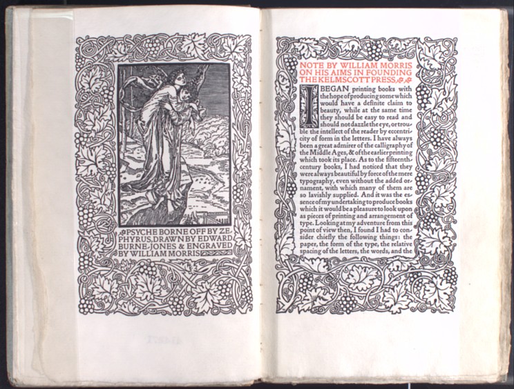
and a half after Morris’s death. The publication shown here includes the frontispiece (detail shown at right), designed
by Edward Burne-Jones, intended originally for an 1866, aborted, illustrated edition of The
Earthly Paradise .
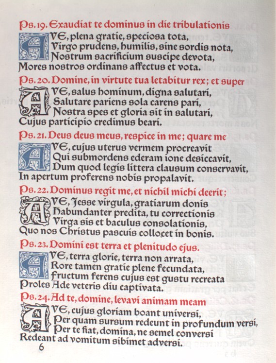 Stephen Langton, d. 1228. Laudes Beatae Mariae Virginis. Hammersmith: Kelmscott Press,
1896.
Stephen Langton, d. 1228. Laudes Beatae Mariae Virginis. Hammersmith: Kelmscott Press,
1896.
Once Morris had solved the problem of finding a source for hand-made paper of sufficient quality, hired appropriately skilled employees, rented space in Hammersmith, installed his equipment, including a Demy Albion press and a Super Royal Genuine Albion Press, he still had to locate a supplier of ink. He searched for a pure product without chemical additives, made from linseed oil, lampblack, and turpentine. Most of the inks he tried had been thinned for use on rotary and cylinder presses, with the result producing a gray, washed-out appearance. With the Albion hand presses, Morris wanted a thicker, slower-drying, very black ink.
Following yet another suggestion from Emery Walker, Morris contacted a German manufacturer, Gebrüder Jänecke of Hannover. Although his pressman complained of the unusually stiff consistency and the excessive work required to mix it and ink the plates, Morris persevered, especially after the ink supplied by the English firm of Shackell, Edwards and Co. caused yellow stains on some pages.
Laudes Beatae Mariae Virginis is the first book Morris printed in three colors, the only other one being Love is Enough. The Jänecke black ink is here contrasted with blue and red, both supplied from commercial sources. The blue was made from ultramarine ash by the firm of Windsor and Newton. The red ink may have been made by Shackell, Edwards and Co., although Morris was never fully satisfied with his reds, and tried many different sources.
For this publication of a section of an early thirteenth-century English Psalter, Morris
printed the line from each Psalm in red, followed by a quatrain in black which applies the Psalm
to the Virgin.
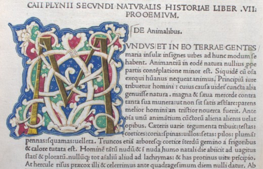 Plinius Secundus. Historia Naturalis. Venice: Nicolaus Jenson, 1472.
The story is told that on the way back to Hammersmith after Emery Walker’s 1888 lecture, Morris turned to Walker and said, “Let’s make a new fount of type.” And so -- the Kelmscott Press began.
Morris studied the large photographs made from Walker’s slides. He compared the work of the earliest printers using his own collection of medieval manuscripts and incunabula and the many books he owned on the subjects of printing, typography, and calligraphy. He had learned through his work with Charles T. Jacobi at the Chiswick Press that imitating old type faces was not enough. He needed to draw out the essential qualities from the best specimens and fashion his own beautiful designs.
The result in 1890 was Golden type. The letterforms are based on the Roman type
designed by fifteenth-century Venetian printers Nicolaus Jenson and Jacobus Rubeus.
Specifically Morris worked with Jenson’s printing of Pliny’s Historia Naturalis (Venice, 1476).
The copy shown here was printed a few years earlier than the one Morris is said to have used.
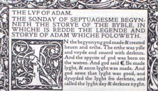 Jacobus de Varagine, ca.1229-1298. The Golden Legend of Master William Caxton Done Anew.
Hammersmith: Kelmscott Press, 1892. 3 vols.
Jacobus de Varagine, ca.1229-1298. The Golden Legend of Master William Caxton Done Anew.
Hammersmith: Kelmscott Press, 1892. 3 vols.
A close examination of individual letters reveals how Morris adjusted Jenson’s designs to suit himself. Morris’s page looks darker due to his thicker strokes, and his slab-like serifs are indeed quite different from Jenson’s. But his goal was letters “pure in form; severe ... solid, without the thickening and thinning of the line ... and not compressed laterally.” Most critics think that he succeeded, although the famous master of typography in the early twentieth century, Stanley Morrison, described them as “positively foul.”
The Golden Legend is a medieval collection of Saints’ lives. Morris intended it to be the
first book produced at his new press -- hence the name of the type. But its length and problems
in securing an adequate paper supply forced a delay, and it was not actually finished until
November 1892. The ornamental borders were designed by Morris; the wood-cut illustrations
were drawn by Edward Burne-Jones.
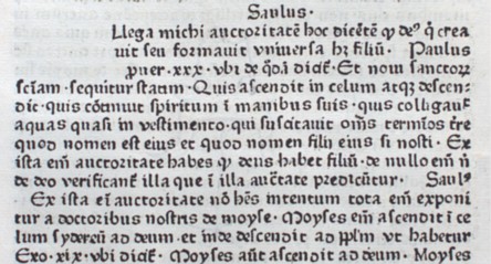 Pablo de Santa Maria, Bp., d. 1435. Scrutinium Scripturarum. Strassburg: Johann Mentelin,
ca.1474.
Pablo de Santa Maria, Bp., d. 1435. Scrutinium Scripturarum. Strassburg: Johann Mentelin,
ca.1474.
Morris had barely finished his designs for Golden type before he began work on a Gothic type. Gothic (or blackletter) type had been the most common typeface in northern Europe during the fifteenth century and well into the sixteenth century. Just like Roman type, the designs were originally copied from handwriting styles. But contrary to the round, open feel of Roman, Gothic is characterized by narrow, tall, pointed designs, acute angles, an absence of curves, and heavy black strokes. Called Textura in Germany, it was the type Johannes Gutenberg designed in the early 1450s for his 42-line Bible.
Given Morris’s attraction to medieval forms, it is understandable that he would want a type similar to the old-style Gothic patterns. As before, he studied fifteenth-century originals, especially the work of Peter Schöffer at Mainz, Johann Mentelin at Strassburg, and Günther Zainer at Augsburg. He even experimented with printing his last pre-Kelmscott romance, The Story of Gunnlaug, in a replica of one of William Caxton’s types. (Caxton was the first printer in England, establishing a shop near Westminster Abbey in 1476.)
Caxton’s blackletter, however, was the extreme Gothic that Morris wanted to avoid. He
found the letters too compressed and generally illegible. Instead he admired the Rotunda type
that developed in Germany. This was a Gothic with some Roman influences that was used for
legal and classical texts; it was considered too informal for liturgical and biblical material. A
sample of Rotunda is shown here in a work printed by Mentelin in 1474. Mentelin was the first
printer in Strassburg. He is perhaps best remembered for a 49-line Latin Bible (1460) and for an
edition of Wolfram von Eschenbach’s Parzival, which he printed in Roman type in 1477.
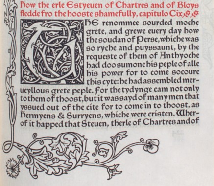 William of Tyre, Archbishop of Tyre, ca.1130-ca.1190. The History of Godefrey of Boloyne and
of the Conquest of Iherusalem. Hammersmith: Kelmscott Press, 1893.
William of Tyre, Archbishop of Tyre, ca.1130-ca.1190. The History of Godefrey of Boloyne and
of the Conquest of Iherusalem. Hammersmith: Kelmscott Press, 1893.
There are certainly many similarities between the Gothic type Morris designed and the particular version of Rotunda that Mentelin used in 1474. Some of the more obvious can be seen by comparing capital letters, the E with rounded upper and lower arms and the S with a horizontal middle stroke; and lower case letters such as the h with the characteristic Gothic hook to the left, the g that is almost a duplicate, and the e with an inclined crossbar. But Morris wanted a semi-Gothic, one that would be legible to Victorian-era readers. Therefore, there are many differences as well: the d that does not bend left and the omission of tied letters (or ligatures) and contractions which in early printing had carried over from scribal cursive writing.
Morris called his new design Troy type, named after The Recuyell of the Historyes of Troye, the first book in which it was used. His initial plan was to use the Troy for his folio editions -- it is an 18-point size. But even in The Recuyell... he realized he needed a smaller font for prefatory matter, glossaries, and the like, so he had a 12-point version cut by his favorite punchcutter, Edward Prince. This he called Chaucer type since it was principally intended for the great work of the Press, Chaucer’s Canterbury Tales.
In The History of Godefrey of Boloyne, Morris used Troy for the text, Chaucer for the Table
of Contents and Glossary, and ornamental borders and decorated initials which he designed. It
is the fourth of the Press’s Caxton reprints, the others being The Recuyell of the Historyes of Troye
(November 1892), The History of Reynard the Foxe (January 1893), and The Order of Chivalry (April
1893).
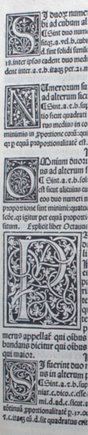 Euclid. Elementa Geometriae. Venice: Erhard Ratdolt, 1482.
The most obvious quality of the books published by the Kelmscott Press is their
decoration. Morris himself said, “It is only natural that I, a decorator by profession, should
attempt to ornament my books suitably....”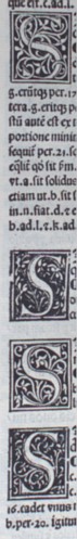 Some observers would say that the “suitable”
decoration became ostentatious, with lavish initials, borders, and illustrations interfering with
the goal of simple communication. Others would support Morris, describing his work as the
ideal of the harmonious whole, successful in the artistic integration of word and picture.
Some observers would say that the “suitable”
decoration became ostentatious, with lavish initials, borders, and illustrations interfering with
the goal of simple communication. Others would support Morris, describing his work as the
ideal of the harmonious whole, successful in the artistic integration of word and picture.
Morris’s designs were again the results of much study of medieval and Renaissance illuminated manuscripts and incunabula. One printer in particular who inspired him was Erhard Ratdolt (ca.1447-ca.1527), an artist who worked in Venice from 1476 to 1486, and then returned to his native town of Augsburg. He printed in both Gothic and Roman type, taking great care with ornamentation. He was one of the first printers to use entrelac initials, i.e., decorated initials used at the beginning of chapters or sections of text in which the letter formed part of an interlaced design or tracery.
In this first printing of Euclid’s famous Elements of Geometry, Morris could not help but
find ideas for his own trellaced initials. On the pages shown here there are six different versions
of the letter S. Clearly Ratdolt engraved many variations, experimenting with the shape of the
letters as well as the vines and flowers.
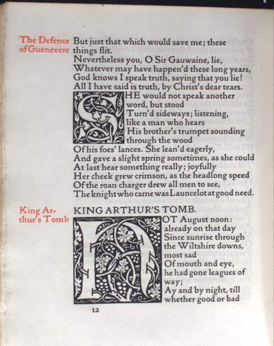 William Morris. The Defence of Guenevere, and Other Poems. Hammersmith, Kelmscott Press,
1892.
William Morris. The Defence of Guenevere, and Other Poems. Hammersmith, Kelmscott Press,
1892.
The Defence of Guenevere is the fifth book published by the Press. Some of the initials are surprisingly like those of the early printers. On these pages, for example, the similarity between the S and some of those drawn by Ratdolt is striking.
Morris was quick to assure his critics and associates that he was not intentionally
copying precedent, and, indeed, his designs continued to change and develop throughout the
life of the Press. Morris provided 644 designs of initials, borders, frames, side ornaments, and
printer’s marks, with thirty-four of these being variations of the letter T. Biographer Fiona
MacCarthy reports that even during his last illness, Morris spent what strength he had in
designing new ornaments and borders for publications still in process.
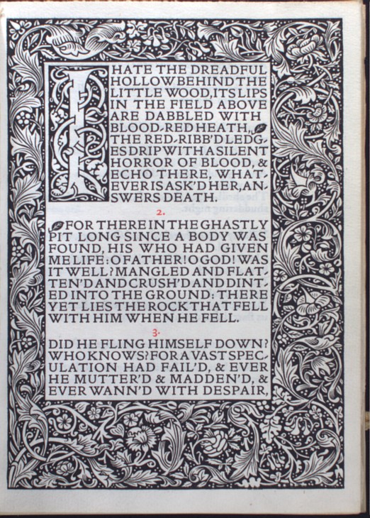
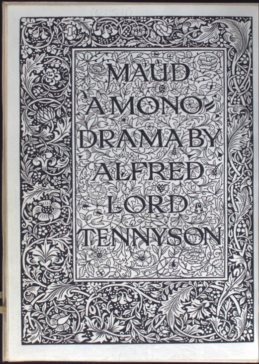 Alfred Lord Tennyson. Maud, a Monodrama. Hammersmith, Kelmscott Press, 1893.
In addition to the decorated initial, Morris also used borders and frames. The frame around the beginning of this text is the simple border which he used in all of the first five books of the Press. Morris designed full, three-quarter, half, quarter, and corner borders for his books. In The History of Godefrey of Boloyne the various sized borders are used throughout. Most of his books, however, are like this one, with decoration limited to a single border, decorated initials, and small decorations such as the paragraph symbol used here.
 The full border serves as an excellent means of understanding another of Morris’s
principles of book design. When he said that the text block should be in the proper position on
the page, he meant that the margins around the text should vary in width. They should be in a
fixed proportion to one another: “the hinder edge (that which is bound in) must be the smallest
member of the margins, the head margin must be larger than this, the fore [i.e., the outer] larger
still, and the tail largest of all.”
The full border serves as an excellent means of understanding another of Morris’s
principles of book design. When he said that the text block should be in the proper position on
the page, he meant that the margins around the text should vary in width. They should be in a
fixed proportion to one another: “the hinder edge (that which is bound in) must be the smallest
member of the margins, the head margin must be larger than this, the fore [i.e., the outer] larger
still, and the tail largest of all.”
The solid, dark block of type which Morris always sought proved to be most difficult to achieve when printing poetry. His solution was to print the opening stanzas as paragraphs separated usually by small leaf ornaments or numbers, although sometimes allowing a line of white between the rectangular stanzas (See page at right).
The example shown here also illustrates his solution to the nearly blank page that normally is opposite page one of a text. By designing a title page with a hand-lettered title engraved against a background of floral or vine ornaments enclosed in a border that mirrors the border of page one, Morris has not only filled in the white space, he has also created a double- page spread that artistically is a single unit (See page above left). Even the crease in the center exposes a minimum of white. The result is usually a most beautiful resolution to the challenges of poetry, and Morris used this format in twenty of the fifty-three Kelmscott books, including his collections of Coleridge, Rossetti, Keats, Shelley, and Swinburne, as well as a few of his prose titles such as The Recuyell of the Historyes of Troye (1892), The History of Reynard the Foxe (1893), The Order of Chivalry (1893), The History of Godefrey of Boloyne (1892), and others.
Maud was an unusual commission for the Kelmscott Press. Morris printed the work,
but it was published by Macmillan & Co., London. It also was one of the few titles that was a
solidly profitable production, costing the Press Ł 202 14s. ld. and Macmillan Ł 400.
 Carl Purington Rollins. A Leaf from the Kelmscott Chaucer, Together with a Monograph. New
York: P. C. Duschnes, 1941.
Carl Purington Rollins. A Leaf from the Kelmscott Chaucer, Together with a Monograph. New
York: P. C. Duschnes, 1941.
The Works of Geoffrey Chaucer is the culminating work of the Kelmscott Press, completed on June 26, 1896, just three months before Morris’s death on October 3. It is the most ambitious, the most richly ornamented, the one revealing the most integration between text, ornament, and illustration. It is the logical conclusion to all of Morris’s theories and tendencies in art, design, and book production. Professor William S. Peterson of the University of Maryland calls it the “litmus test which measures one’s response to Morris’s work as a printer.”
It certainly was a book long in the making. Morris was thinking of printing a Chaucer when he first designed his Troy and Chaucer type in 1891, and work began with the borders as early as February 1893. Burne-Jones and William H. Hooper, principal wood-engraver for the Press, created eighty-seven illustrations from 1892 through 1895. F. S. Ellis was assigned the difficult task of securing permission from the University of Oxford’s Clarendon Press to reprint texts they had just published in 1894. Printing began in August 1894, and by early 1895 another press was acquired in order to hasten the project along. Thus, even while all the other printing jobs were in process, work on the Chaucer was never far out of mind. During Morris’s last year, he finished designing a special pigskin binding for a few of the copies, and engraved the title page.
This single leaf comes from an original, incomplete copy whose pages were distributed
along with a short essay by Rollins. It is an example of a typical page of the text containing the
normal decorated initials and shoulder note in red ink.
| INTRODUCTION | WRITINGS | SOCIALISM | BIOGRAPHY |