 |
Sandra Lach Arlinghaus
University of Michigan, School of Natural Resources and Environment
Community Systems Foundation
Institute of Mathematical Geography
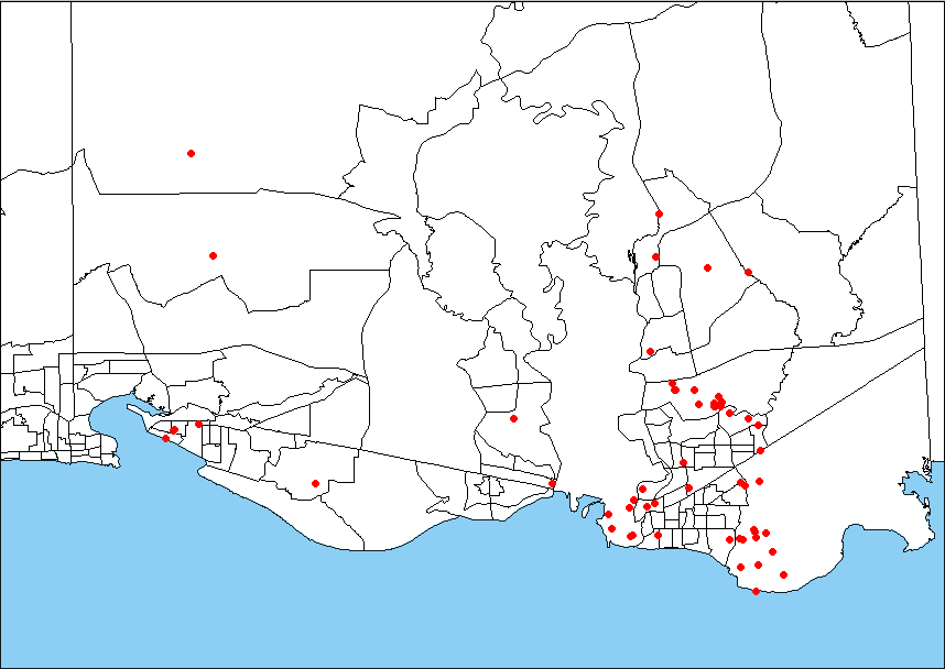
The Environmental Protection Agency (EPA) maintains an online mapping facility, called Landview III, that contains data and site locations for hazardous sites of various sorts, as well as selected Census, United States Geological Survey, and other, data and boundary files. The user visits the EPA site and is permitted to download, free, the Landview software and one county boundary file and one county data file (per transmission). For those, such as precollegiate teachers, this is a marvelous resource for gaining some mini-GIS mapping capability. For those with full GISs on their desks, Landview also serves as a fine source of location and data files. The data files come in .dbf format and many already contain positional information as decimal degrees of latitude and longitude. Thus the files map easily in, for example, ArcView 3.2 (Environmental Systems Research Institute--ESRI). Simply open the table of interest and open that as an Event Theme which can then be converted to a shape file. The maps below offer an example of this capability. In addition to Landview III, other software packages used were: ArcView 3.2 (ESRI), Spatial Analyst Extension (ESRI), 3D Analyst Extension (ESRI), Animal Movement Extension to ArcView (free), Adobe PhotoShop 5.5, Netscape Communicator 4.05, and MS Excel (Microsoft Office 97, Professional version) Windows 98 (Microsoft).
|
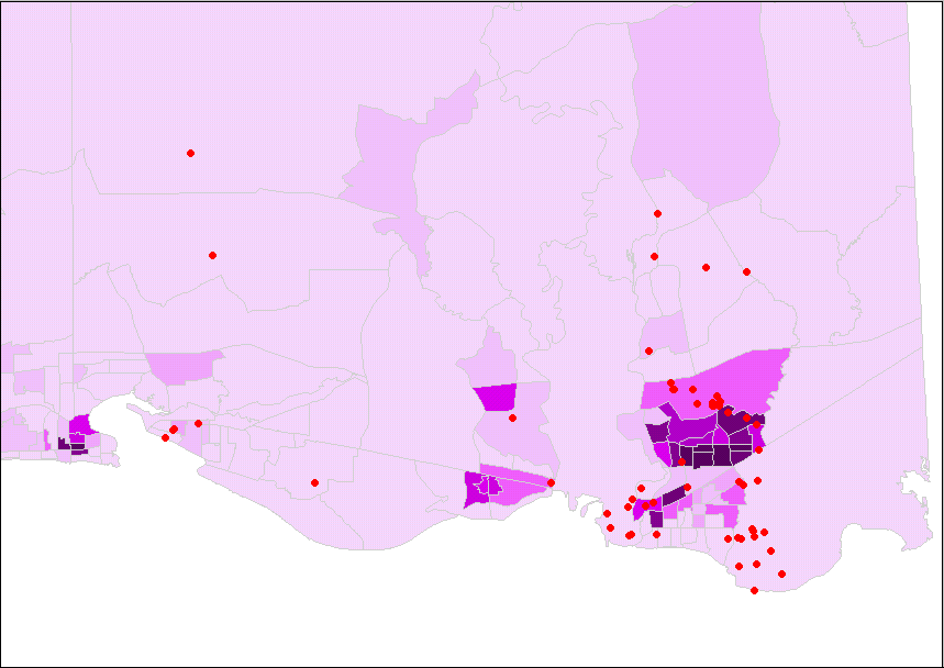
Map 2. A natural next step in the mapping process might
be to create a thematic map using Census data for the blockgroups.
One might consider demographics of various sorts in relation to EPA site
location. The map below shows the blockgroup polygons colored by
racial categories of "black" or African-American population and "white"
or Caucasian-American population normalized by 1990 total population for
each blockgroup. Deeper shades of purple indicate higher densities
of African-American population. One direction that further mapping
effort might take is to overlay other boundary files, such as rivers, and
also to create more thematic maps based on other demographic, economic,
and physical variables. The remaining maps suggest another approach.
 |
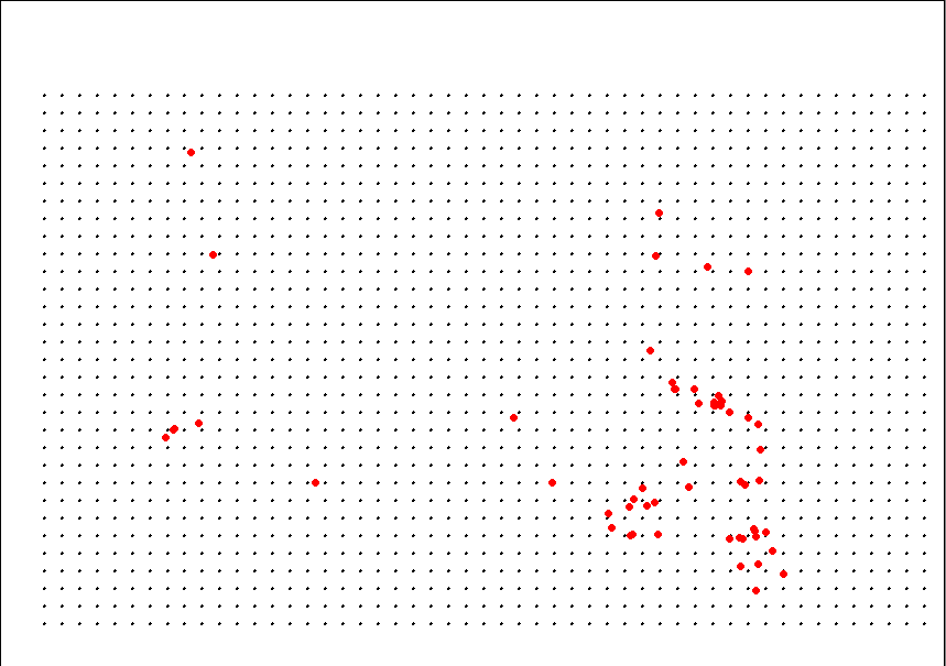
Map 3. The blockgroup boundaries were removed. A
grid of points, spaced at 0.01 degrees of latitude and longitude was superimposed
on the map. The grid database was created in Excel and brought into
ArcView as an Event Theme.
 |
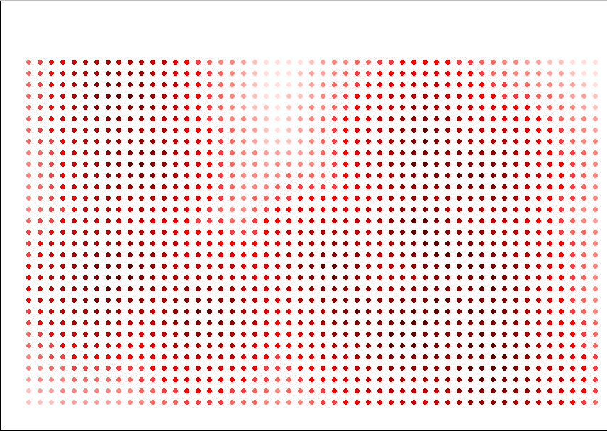
Map 4. The grid points were assigned weights based on distance
from EPA sites. Those points closest were colored with the darkest
shade of red; those fartheset away with the lightest shade. The distances
were calculated in Animal Movement Extension (Hooge and Eichenlaub, 1997),
Movement|Calculate Distance, with distances measured from EPA sites to
grid points. These distances were then used as weights and the grid
points (as a shape file) were shaded using a standard color ramp.
Weights might be assigned using any of a number of standard weighting techniques
or using technique designed by the cartographer or other map creator (Tobler
and Wineberg, c.1975 is one classic example).
 |
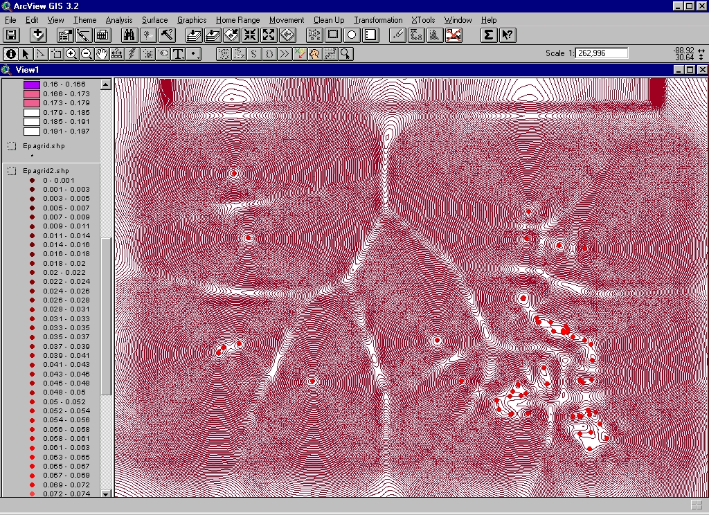
Map 5. The grid points were then finely contoured, in 0.001
parts of a unit. The Surface|Create Contours command was employed.
The method of interpolation chosen was Spline, the Z-value used was the
distance value calculated above, and the type of contour selected was a
tension contour. Here the screen capture is placed directly from
ArcView into the html file. Note the apparent swale lines
and saddle points in the contouring representing troughs based on the distance
data and peaks or flat surface surrounding the actual sites.
 |
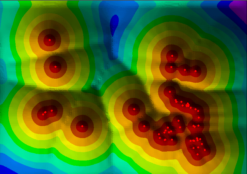
Map 6. The contours were then converted to a Triangulated
Irregular Network (TIN) (Arlinghaus et al., 1994) to suggest a surface
based on distance from EPA sites. Warm colors represent locations
close to numerous EPA sites; cool colors represent locations farthest from
EPA sites. Shading, coupled with the use of a finely-contoured surface,
make the peaks and valleys stand out. The TIN is calculated by the
software; basically, it triangulates the contours creating tiny triangular
facets, which when colored and shaded, suggest a surface.
 |
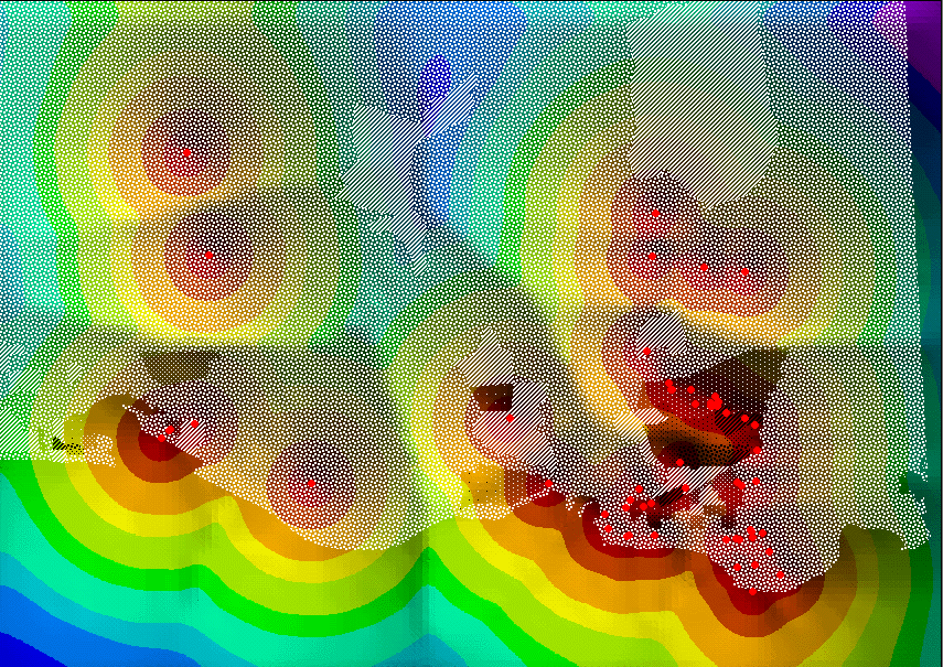
Map 7. The TIN is then covered with the thematic map shown
in Map 2. Here, once again, the demographic data is calculated by
block group: percent "black" and percent "white". Denser patterns
of black and white represent greater block group densities of African-American
and Caucasian-American populations. The block group boundaries were
colored transparent as were the backgrounds behind the patterns so that
the TIN would show through. To preserve the invisible background
outside of ArcView, the Windows-universal screen capture, Alt+PrintScreen,
was used to put a copy of the screen image on the Windows Clipboard.
The clipboard was then pasted (Ctrl+v) into a blank canvas (File|New) in
Adobe PhotoShop (which senses the size of the Clipboard image on opening
a new blank canvas) where the image was cropped.
 |
The evidence of maps can communicate information differently to different
people. As mapping software becomes easier and easier to use, one
can only hope that curricular matters keep pace. Maps like these
in the hands of a policy maker can be helpful or dangerous weapons; fine
geographic education can make them become the former.
Arlinghaus, S. Austin, R., Arlinghaus, W., Drake, W., and Nystuen, J. Practical Handbook of Digital Mapping Terms and Concepts. CRC Press. 1994.
Hooge, P. N. and B. Eichenlaub. 1997. Animal movement extension to ArcView. ver. 1.1 and later. Alaska Biological Science Center, U.S. Geological Survey, Anchorage, AK, USA.
Tobler, W. R. and Wineberg, S. c.1975. A Cappadocian speculation.
Nature.